Branding Programa PICE
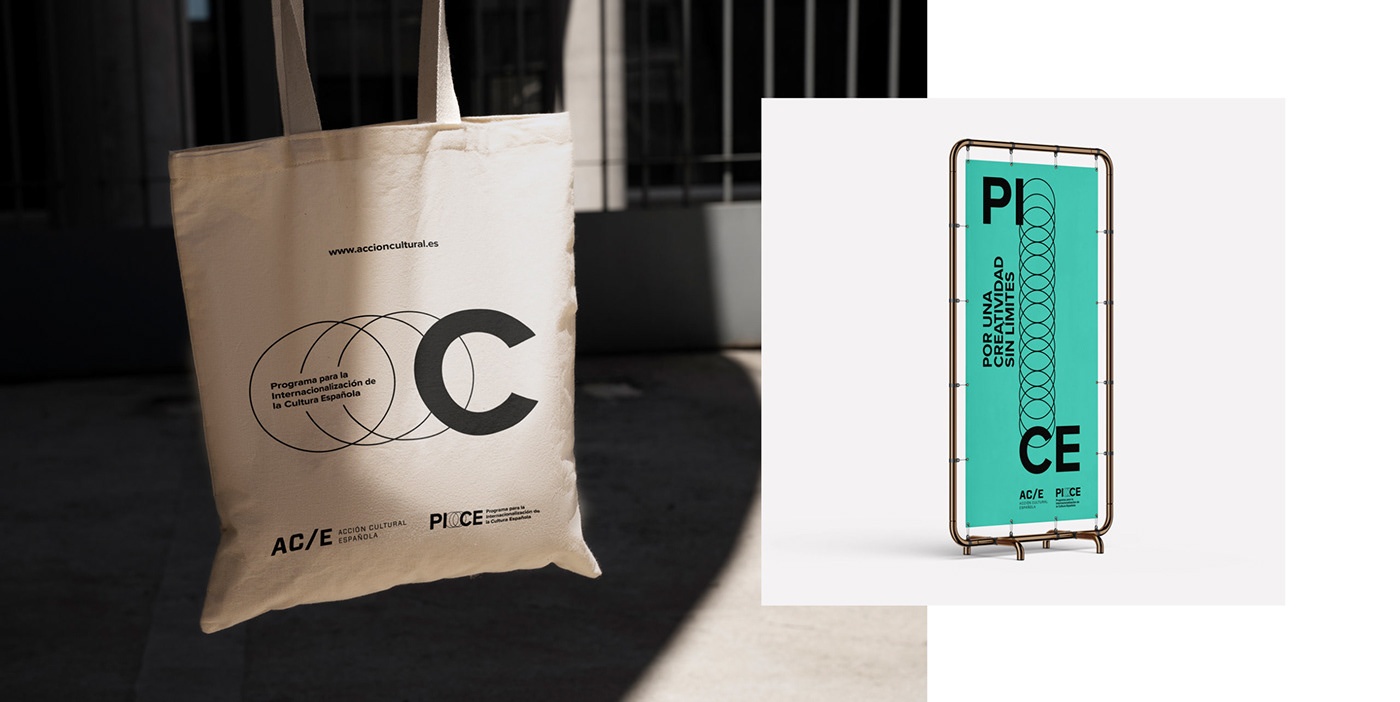
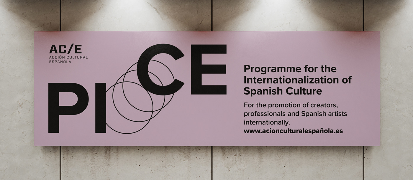
Branding project for the PICE Program of A/CE Acción Cultural Española, which promotes and facilitates the presence abroad of the Spanish creative and cultural sector. This program gives priority to emerging proposals that need an external projection and that reflect the plurality of the current culture.
The brand is a graphic wink that represents the objective of externalization, impulse and projection of our culture, through a symbol integrated between the two syllables of the brand. Formally, the displacement of the syllable "CE", draws a globe and, at the same time, the wake of the Spanish Culture moving outwards. This superimposition of circles can also remind us of a network of connection between Spain and the outside world. It is the graphic representation of the Internationalization of Culture.
It is a mark with a dynamic format, that is to say, its composition can vary depending on the direction in which the "CE" of Spanish Culture moves. These freer versions of the brand are designed for more informal applications such as social media, communication, etc.
At a chromatic level, the brand always works in black on white or colored background. In addition to adopting A/CE's corporate aqua green color, a bright and fresh range such as mauve or lime yellow has been proposed.
accioncultural.es/en/progPICE
Branding Programa PICE
Proyecto de branding para el Programa PICE de A/CE Acción Cultural Española, que impulsa y facilita la presencia exterior del sector creativo y cultural español. Este programa da prioridad a las propuestas emergentes que necesitan una proyección exterior y que reflejan la pluralidad de la cultura actual.
La marca es un guiño gráfico que representa el objetivo de externalización, de impulso y de proyección de nuestra cultura, a través de un símbolo integrado entre las dos sílabas de la marca. Formalmente, el desplazamiento de la sílaba «CE», dibuja un globo terráqueo y, a la vez, la estela de la Cultura Española moviéndose hacia el exterior. Esta superposición de círculos puede recordar también a un tejido o red de conexión entre España y el exterior. Es la representación gráfica de la Internacionalización de la Cultura.
Es una marca con formato dinámico, es decir, que su composición puede variar en función de la dirección en que se desplace la «CE» de Cultura Española. Estas versiones más libres de la marca están pensadas para aplicaciones de carácter más informal como RRSS, comunicación, etc.
A nivel cromático, la marca siempre funciona en negro sobre blanco o fondo de color. Además de adoptar el color verde agua corporativo de A/CE, se ha propuesto una gama luminosa y fresca como el malva o el amarillo lima.